Design at the 2018 Olympics
The Olympic Games are an unbelievable feat. Not only for the incredible hard working athletes but the incredible preparation that is required for years before hand to ensure infrastructure, transportation, safety, hospitality and so much more for each set of Summer or Winter games.
One aspect that we see a lot of but might not give much thought to during the Games is design. From the official logos of each Olympiad, to the team uniforms and advertising, design is a constant presence.
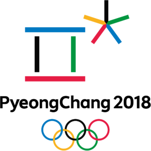
Logo
Did you know PyeongChang 2018’s official logo was released back in 2013? The characters represent sounds from the Korean alphabet, Hangeul and symbolize the meeting of heaven and earth, ice, snow and the competing athletes. Learn more about the specific characters here
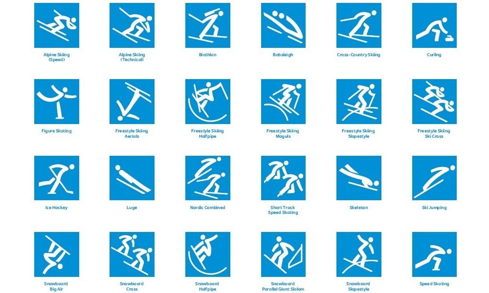 Pictograms
Since 1964, a set of pictograms have been designed for each games. These images represent each event and will be implement across a variety of mediums including signs, tickets, online, tv and more. Each set varies in its design to reflect the imagery and feel of that particular games.

Uniforms
Style and patriotism is a driving force of the Opening Ceremony outfits for Team USA but this year electronic ink is a game changer. Designer Ralph Lauren incorporated a heating system in each parka to keep the athletes warm in the cold South Korean temperatures.
How do they do it?An American Flag has been printed on the inside of each jacket with the electronic ink and when prompted by a command on the athlete’s cell phone the flag emblem and ink keeps the wearer warm for up to 11 hours.
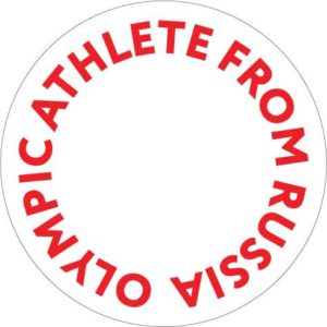
Plain Logos
While the United States will wear their uniforms loud and proud at the Winter Games, Russian athletes won’t be allowed the same privilege. Due to doping scandal violations, Russian athletes will be appearing and competing in attire with a purposely generic logo stating “Olympic Athlete from Russia”. The athletes must follow strict rules set by the International Olympic Committee to refrain from promoting Russia in any way.
Punishment by uninspiring design, what an interesting concept…
All Eyes on the Games
As you’re watching the games during the next two weeks, keep an eye out for interesting uses of design. While the 2016 Rio games gave us the first 3D logo in the history of the games along with fluid uses of bright and bold colors, expect PyeongChang to be more minimalistic and reserved with flat design and the traditional five Olympic Colors.
No matter the design, we are sure to be inspired and amazed by the athletic skill from the top athletes in the world. Go Team USA!
Image Sources: Logo | Pictogram | TeamUSAOutfit | RussianLogo
